Text + Fonts
One of the easiest ways to tell a player something is to use written words. It may not be the most elegant design decision, but it gets the job done.
In this lesson, we'll first describe how text is stored, and then talk about a general text display pipeline including shaping and rendering. We will conclude with a discussion of some of the simplifications of the full pipeline that are often appropriate for games.
Text Encodings
Before even talking about font rendering, let's talk about how you might store strings. There are a lot of characters out there -- hundreds from alphabetic scripts (e.g., latin, greek) and thousands from logographic scripts (e.g., hanzi). In the past, there have been many many many encoding standards (e.g. ASCII) for mapping the values of bytes to these letters.
In addition to characters, there are things that appear in text that aren't graphical but influence the appearance of the text (e.g., spaces, tabs, ways of combining other symbols). To avoid confusing graphical symbols and units of textual representation, we'll call the things that one might encode in bytes of text "code points".
These days, the encoding standard of choice is Unicode, which assigns meaning to 143,859 code points (and has space for more, allowing up to 216 - 211 + 220 = 1,112,064 total code points -- corresponding to the range from U+0000 to U+10FFFF, less a reserved range for U+D8000 - U+DFFF).
So, how do you store code points when each point's index can take up to 21 bits?
UTF-32
The (seemingly) most straightforward way to do this would be to use a 32-bit integer for every code point. This allows each code point to be easily addressed, makes computing the lengths of strings easy, and -- admittedly -- wastes a lot of bits.
I also say "seemingly" because UTF-32 doesn't seem to have much text-editor support. Also, care must be taken so that big-endian and little-endian systems do not interpret files differently. And even the idea that it makes computing string length easy is not entirely correct -- there are still "combining characters" which merge codepoints into a single symbol.
UTF-16
A compromise option might instead be to use 16-bit values. In this encoding, values in the ranges 0x0000-0xD7FF and 0xE000 - 0xFFFF map directly to code points. That 0xD800 - 0xDFFF range is used to encode larger values using "surrogate pairs".
uint32_t code_point = /* some value */;
if (code_point < 0x10000) { //single value:
	assert(code_point < 0xD800 || code_point > 0xDFFF); //these code points are reserved
	output.push(code_point);
} else { //surrogate pair:
	code_point -= 0x10000;
	assert(code_point < 0x100000); //must be a 20-bit number
	output.push((code_point >> 10) + 0xD800); //high surrogate
	output.push((code_point & 0x3ff) + 0xDC00); //low surrogate
}
Note that in addition to needing to worry about endianness (there is a special "byte order mark" character for this), our code still can't figure out string lengths by counting bytes. At least strings will generally be smaller, since Unicode tries to map commonly-used code points toward the bottom of code space.
A precursor to UTF-16 is widely used as an character encoding on Windows. One of the fun corner cases is that Windows NTFS filenames can include surrogate pair fragments, e.g., can be invalid UTF-16 (this should worry you).
UTF-8
UTF-8 is a byte-based encoding which takes between one and four bytes to encode each code point. The characters 0x00-0x7f (which happen to match "low ASCII", and contain the roman alphabet) are encoded as-is, meaning that almost all ASCII documents are already UTF-8 encoded.
The UTF-8 encoding is variable-width, with the first byte giving the width in leading 1's, and the remaining bytes carrying the appropriate bits:
uint32_t cp = /* some code point */;
if (cp <= 0x7f) { //7 bits packed as 0x0vvvvvvv
	output.push(cp);
} else if (cp <= 0x7ff) { //11 bits packed as 0x110vvvvv 0x10vvvvvv
	output.push(0xC0 | (cp >> 7));
	output.push(0x80 | (cp & 0x3f));
} else if (cp <= 0xffff) { //16 bits packed as 0x1110vvvv 0x10vvvvvv 0x10vvvvvv
	output.push(0xe0 | (cp >> 12));
	output.push(0x80 | ((cp >> 6) & 0x3f));
	output.push(0x80 | (cp & 0x3f));
} else if (cp <= 0x10ffff) { //21 bits packed as 0x11110vvv 0x10vvvvvv 0x10vvvvvv 0x10vvvvvv
	output.push(0xf0 | ((cp >> 18) & 0x7));
	output.push(0x80 | ((cp >> 12) & 0x3f));
	output.push(0x80 | ((cp >> 6) & 0x3f));
	output.push(0x80 | (cp & 0x3f));
} else {
	assert(0 && "will never have a code point this big");
}
(NOTE: code adapted from http-tweak.)
UTF-8 is the most widely used character encoding on the internet, and is probably the one one you want to use when thinking about encoding text. Notice that UTF-8 "just works" when treated as if it were ASCII. Linux and MacOS provide good UTF-8 support, as do many Windows programs. Though some Windows programs (Notepad) have historically done really silly things with UTF-8, like include a UTF-16 BOM encoded as UTF-8 at the start of files.
Shaping and Rendering
Well, that was complicated. But now that you know how to read codepoints from stored text, it's as simple as looking up the picture for each codepoint and drawing them to the screen, right?
Unfortunately, it is not.
Code Points to Glyphs
Fonts contain glyphs (pictures), while text contains codepoints. So in order to draw text, your code will need to figure out which glyphs correspond to a sequence of codepoints, and how to position those glyphs. This process is generally called "shaping".
Our nest-libs package contains a shaping library called Harfbuzz.
As you might expect for something complex enough to warrant its own library, text shaping is difficult. We will discuss the two primary difficulties that arise when shaping English (well, roman alphabet) text below, but further complications arise in, e.g., calligraphic scripts, where -- for example -- letters can have different forms according to their positions in the word.
Ligatures
The first challenge in producing a sequence of glyphs from codepoints is that roman-alphabet fonts generally have more glyphs than they have letters and punctuation marks. This is because certain letters have shapes that print better when combined. Common ligatures (glyphs combining more than one letter) in English include "ft", "fi", and -- in some fonts -- "fft".
Ligatures mean that your text rendering system needs to look at groups of codepoints in order to determine which glyph(s) to produce. It also needs to consider the capabilities of the font. Different fonts contain different ligatures.
In a game context you can use ligatures to do all sorts of hack-y things.
For example, in Rktcr I used ligatures in the controls font to make, e.g., "escape" typeset as " ".
".
Kerning
The second challenge in laying out glyphs is figuring out how to position them. The simplest thing to do would be to store an advance (amount to move the anchor position) with each character and have your font shaping engine run a loop over glyphs:
void position_glyphs(
		std::vector< Glyph > const &glyphs,  //in; list of glyphs
		glm::vec2 *anchor_,                  //in/out; anchor point of next glyph
		std::vector< glm::vec2 > *positions_ //out: list of glyph positions
	) {
	assert(anchor_);
	auto &anchor = *anchor_;
	assert(positions_);
	auto &positions = *positions_;
	positions.clear();
	positions.reserve(glyphs.size());

	for (auto const &glyph : glyphs) {
		positions.emplace_back(anchor);
		anchor += glyph.advance;
	}
}
The trouble with this approach is that the kerning (spacing between glyphs) that looks best actually depends on the pair of glyphs surrounding the space. So, for example, "LT" might look better with closer spacing than "LX". Fonts will generally store information about how to properly space pairs of letters in a kerning table.
(Now that you know the term "kerning" you are officially a font nerd. Start noticing bad kerning in signs and printed materials. Complain to your friends.)
Glyphs to Pixels
Okay, so now your code has computed what glyphs to draw and where to draw them. Things are finally easy now, right?
Well, in most modern font formats, glyphs are filled areas of solid color bounded by (quadratic) spline outlines. So you'd think that it would be sufficient to just fill in the pixels surrounded by the outline.
Just like shaping, this turns out to be a lot more complicated than you'd expect. Our nest-libs package contains a font loading and rendering library called FreeType.
But why do we need such complexity? It turns out that just filling in a font outline works quite poorly for small fonts:
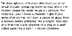
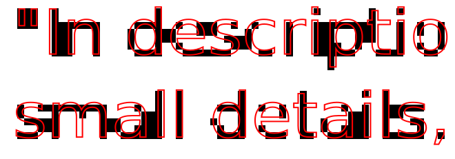
Anti-Aliasing Smooths Unaligned Features
Of course, as folks who have taken graphics, we know that the problem above is called aliasing, and we have a suite of anti-aliasing techniques (e.g., supersampling) to combat it. Generally speaking, these techniques make the color of a pixel proportional to the amount of the glyph's area covering the pixel.
The trouble is that anti-aliasing makes small text look blurry:
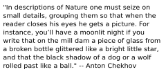
Hinting Aligns Glyph Features To Pixels
The key to making small fonts readable is to align them to the pixel grid. The (semi-automatic) process of alignment is called hinting.
What a font hinting algorithm generally does is to detect (or have annotated) parts of the glyph that are meant to be thin and continuous lines, and carefully align these to pixel boundaries. In effect, this comes up with custom "pixel-art" versions of each glyph for small font sizes.
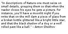
Coming up with good hinting algorithms is hard enough that back when TrueType (ttf) was first specified, it supported running arbitrary programs embedded in the font in order to perform hinting. (So that font authors could define their own, font-specific, hinting algorithms.) Whenever your "data" format starts to become Turing complete you should be worried!
Thankfully, modern general-purpose hinting algorithms are good enough that bytecode interpreters are no longer required to display fonts.
Sub-Pixel Anti-Aliasing Provides More Resolution
LCDs, OLEDs, and even CRTs don't display uniform colored squares. Rather, they juxtapose RGB "sub-pixels" in order to create a final image:
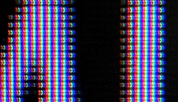
It turns out that -- if your code knows the sub-pixel layout -- it can perform anti-aliased rasterization to sub-pixels instead of to pixels. This is known as "sub-pixel anti-aliasing", and is... well... contentious. Some folks like the extra sharpness; others dislike the "colored fringes" on the text.

Oh, also, color
Generally, color has not been a part of fonts. Fonts provide an outline and it is up to the program that rasterizes the font to know what color to fill the outline with.
But, as an added complication, extensions to OpenType (a modern font format) have been proposed to support more colorful glyphs for emoji (see wikipedia):
- Apple proposed storing color bitmaps.
- Google proposed storing color bitmaps in a different format.
- Microsoft proposed storing several layers of outline data.
- Adobe proposed embedding svg data into fonts.
So which one was included into OpenType? They all were.
Text In Games
Now that we've discussed all the complexity of converting bytes representing text into pictures, let's talk about how to simplify and adapt things for games. In general, these techniques involve avoiding some of the complexity above by avoiding using text in certain ways.
Pre-Rendered Text: Move Complexity to the Asset Pipeline
In the simplest case, you might write a utility that pre-renders all of the text you need in the game as bitmaps, texture-mapped meshes, or geometry. This utility could be part of your asset rendering pipeline.
Or, perhaps even more simply, you could just draw all of the text you wanted in the game in some art program and save it as a picture or mesh to be handled by your existing sprite or object pipelines.
Bitmap Fonts: Pre-Rendered Glyphs
If your game needs more generality than can be provided by pre-rendering all text, you can still avoid some of the complexity of font rendering by using a library of pre-rasterized glyphs.
For pre-rasterized glyphs to work, you'll need to be able to guarantee that your game is drawing with fonts large enough that hinting does not matter, or shaping text in such a way that glyphs always are drawn at the same pixel offset (so that hinting is correct).
An extreme version of the latter case would be to ignore advanced shaping features (like variable-width characters or ligatures), resulting in a font where all characters correspond to a single code point and have uniform pixel size.
Implicit-Function Text
Games sometimes place text in a 3D world where players can view it both from very far away and very close up.
This is a problem because text stored a texture looks great from far away (thanks to mip-mapping) but blurry up close; and text stored as geometry looks good up close (nice sharp edges) but aliases badly when viewed from far away (also, generally, using geometry for text uses a lot of triangles).
Conclusion
In this lesson, we covered the basic text drawing pipeline: from bytes to codepoints to positioned glyphs to pixels.
Font loading and rendering, in general, is very complex. Far more complex than you might expect from something so widely deployed.
Using text in your game involves thinking about context and shortcuts. Sometimes your asset pipeline can take care of text drawing pipeline for you, or artistic choices can simplify it; but sometimes you do actually need to just write the darn code.